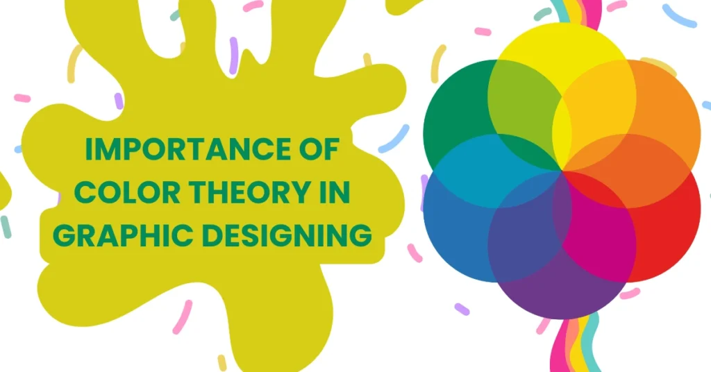
Overview Of Color Theory importance in Graphic Design
Color is a universal language that resonates deeply with human emotion and perception In professional graphic designing color transcends decoration to become a powerful communication tool When strategically applied color guides user attention evokes brand personality and fosters visual memorability Understanding color theory empowers graphic design to unlock the full potential of their work.
From global brand logos to mobile app interfaces effective graphic design harnesses color theory with intention and insight Thoughtful color selection pairing and application transforms ordinary visuals into compelling experiences In this guide you will explore the fundamental concepts advanced techniques and practical strategies behind color theory to elevate your projects and create work that connects with modern graphic design trend.
1 The Fundamentals of Color Theory For Graphic Design
The Color Wheel and Its Origins
The color wheel is a central tool that brings clarity to color relationships It arranges primary secondary and tertiary colors in a circular format allowing designers to visualize how hues connect Complementary colors sit opposite each other analogous colors are adjacent and tertiary colors blend primary with secondary This foundational understanding is vital in UI graphic design and digital branding where consistent color palettes define user experience.
Hue Saturation Brightness Explained
Color Models and Their Applications
Different mediums require different color models For digital projects RGB is the standard additive model while CMYK is used for printing HSL offers an intuitive interface for adjusting hue saturation and lightness Recognizing the differences ensures consistency across platforms especially in digital branding and modern print strategy.
2 Why Color Theory Matters in Professional Graphic Design
Emotional Impact and Color Psychology in graphic design
Color evoke emotion and influence decision Blue communicate trust and professionalism Red convey urgency and energy Green signify growth balance and harmony and yellow bring optimism Designer integrate these association in graphic designing to connect with viewer and enhance visual storytelling.
Establishing Brand Identity with Color
Color is one of the strongest brand elements People often recognize a brand solely by its color Think of the bold red of Coca Cola or the signature blue of Facebook Consistent color use in digital branding and traditional media builds trust recognition and loyalty.
Improving Readability and Accessibility
Contrast enhances readability Light backgrounds with dark text or vice versa improve accessibility Designers use color not only for beauty but also functionality ensuring compliance with accessibility standards and optimizing user experience.
Guiding Visual Hierarchy with Color
Color directs attention Bright saturated hues emphasize calls to action while muted tones create a subtle backdrop This strategy is widely used in UI design and mobile applications where user navigation and engagement are driven by color classification.

3 Principles of Color Harmony and Palette Creation
Complementary Analogous Triadic Monochromatic Schemes
Harmonious color schemes form the backbone of effective design Complementary schemes create striking contrast analogous schemes foster unity triadic schemes balance variety and monochromatic palettes deliver sophistication This mastery supports cohesive digital branding and advanced UI design.
Neutral Bases with Accent Colors
Neutral tones such as black white and gray anchor designs while accent colors create focus This method is popular in modern design trends and is effective for websites presentations and mobile application.
Structuring Content with Color
Organizing sections by related hues enhances scanability and clarity in infographics websites and social media designs This structured use of color supports both visual storytelling and functional usability.

4 Real World Applications of Color Theory
Branding and Marketing Collateral
From logos to packaging and advertisements color theory ensures consistent emotional and psychological resonance Graphic design professional use color testing to maintain harmony across print and digital media enhancing brand equity.
Web and App Interface Design
Color in UI design signals interactions guides navigation and supports accessibility Buttons alerts and menus rely on color cues to communicate purpose Consistent and strategic use of color improves user experience and retention.
Infographics Data Visualization and Presentations
Color simplifies complexity in visual storytelling Charts and presentations with limited palettes improve comprehension while gradient or diverging schemes display ranges or highlights for data emphasis.
Environmental and Spatial Designs
Physical spaces like trade show booths and office branding benefit from strong color theory Outdoor designs use high contrast to remain effective under varying lighting conditions and distances.
5 Advanced Color Considerations
Cultural Color Symbolism and Context
Color meaning shift globally Red represent luck in some culture but danger in other White symbolize purity in Western context but mourning in other Researching these nuance ensure inclusivity in digital branding and global campaign.
Balancing Trends with Timeless Appeal
While trendy palettes such as neon gradients capture attention timeless schemes provide longevity Smart graphic design blends both ensuring designs feel fresh yet stable across seasons and campaigns.
Subtle Emotional Shifts via Tone Adjustments
Small changes in saturation or brightness adjust mood while keeping brand identity intact These subtle refinements help maintain consistency across platforms.
Accessibility and Inclusive Design
One in twelve men have some form of color vision deficiency Accessible graphic design includes shape icons or text with color so that meaning is clear to every user This approach improves usability and aligns with inclusive design principles.
6 Practical Tools and Techniques for Designers
Palette Generation and Testing Tools
Digital tools like Adobe Color Coolors and Colormind help designers generate harmonious palettes efficiently These resources streamline the creative process in digital branding and marketing campaigns.
Swatch Libraries and Team Sharing
Shared libraries in design software maintain brand consistency across projects Collaborative teams rely on these tools to ensure visual identity is uniform in all deliverables.
Print Calibration and Proofing Workflows
Color calibration and proofing ensure printed results match on screen visuals This technical step is critical in professional design workflows.
Testing Iterating and User Feedback
Testing colors in different environments devices and lighting conditions ensures optimal results Iterative feedback loops help refine design decisions for maximum engagement and impact.
7 Case Studies of Effective Color Use
Tech Startup Rebrand
A tech startup updated its color palette from green to a cooler blue green The new palette signaled trust and innovation aligning with modern design trends and boosting engagement across digital platforms.
Nonprofit Annual Report
A nonprofit used neutral tones with bold accent colors to highlight key metrics The clean design improved readability and added professional polish to the presentation.
E Commerce Button Optimization
An e commerce company tested different call to action button colors and found that warm coral significantly improved conversions This simple shift reinforced how color theory impacts behavior and results.
8 Backing Theory with Research and SEO Best Practices
Aligning Content with Search Intent
By providing comprehensive and detailed information this article addresses informational and educational intent making it more visible and useful in search results.
Structured Headings Enhance SEO
Numbered sections and clear subheadings improve readability and make content easier for search engines to index boosting visibility for terms like digital branding and UI design.
Using Authoritative Links
Referencing trusted sources such as Wikipedia and professional organizations strengthens credibility and signals quality content to search engines.
Keyword Usage without Stuffing

9 Historical and Theoretical Foundations
Early Theories and Scientific Foundations
Color theory has roots in ancient philosophy but was formalized through scientific discoveries Newton explored the spectrum of light while later theorists examined how colors interact influencing perception.
Influence of Josef Albers
Josef Albers advanced modern understanding of color relationships His work Interaction of Color remains an essential resource for professionals studying how context changes the way colors are perceived.
Conclusion
Color theory is both art and science shaping the future of professional graphic design Mastery of color builds stronger brands enhances digital branding creates effective UI design and tells powerful visual stories Through research practice and attention to detail designers can create experiences that resonate with audiences on every platform.
Whether you are building a brand refining a website or producing marketing content thoughtful use of color ensures your designs are not only visually appealing but also meaningful and impactful Embrace color as a core element of your creative process and you will see its power in every project you deliver.

